:max_bytes(150000):strip_icc():format(webp)/MeganBeauchamp-9454b1017cb44935b3d0ddaa101efa2e.JPG)
:strip_icc():format(webp)/cdn.cliqueinc.com__cache__posts__258644__pink-paint-colors-258644-1527135154242-image.700x0c-1988a96b626e45b0913d3ebb7a741f911-0ab28e53cbc64d4f80ebb22c08626315.jpg)
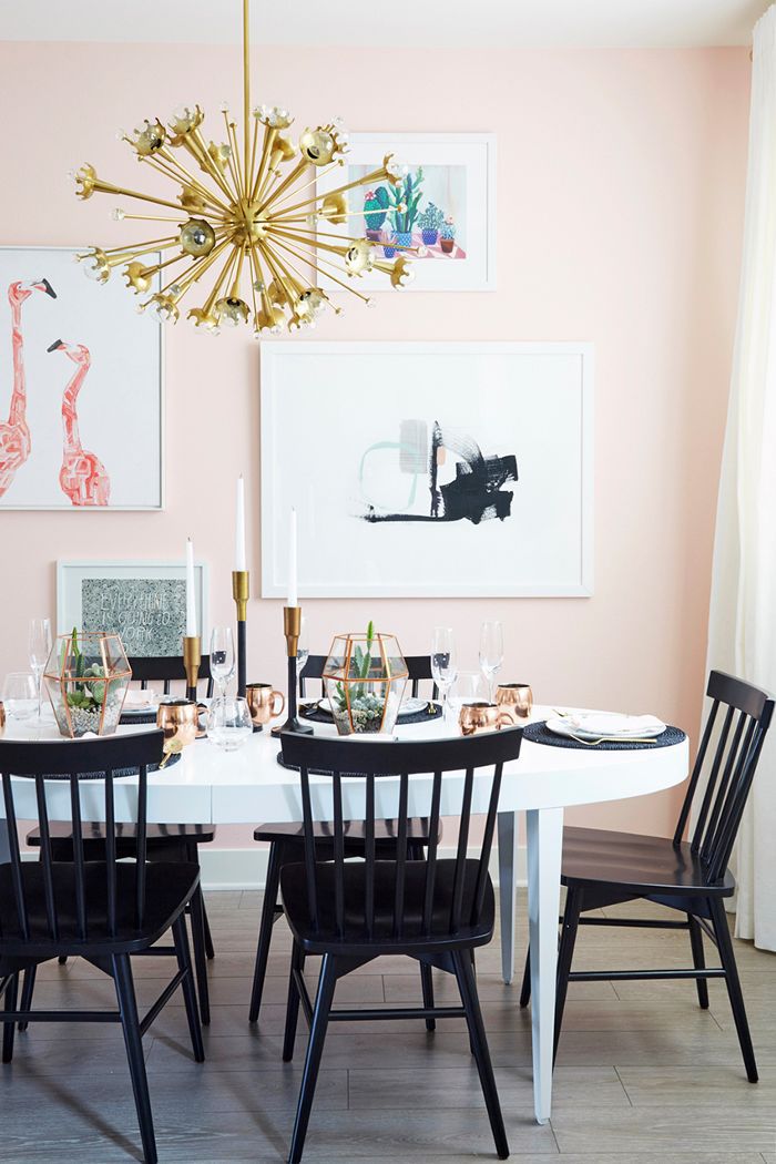
DESIGN: Emily Henderson; Photo: Zeke Ruelas
Remember when millennial pink was the hue of the moment? Everything from velvet accent chairs and chic sofas to marble countertops could be found in the signature shade of blush. Though the once-popular hue has waned in popularity, our love of pink is still going strong. In search of shades of the traditionally flirty tone that feel fresh, we tapped some of our favorite interior designers for their expert-approved picks.
- Color Family: Pinks
- Complementary Colors: Greens
- Pairs Well With: Neutrals like white and gray for a sophisticated feel or brights such as orange, green, or yellow for cheerful or tropical vibes.
- Mood: Positive and cheerful
- Where to Use: Small spaces like office or bathroom, or a children's room
Spanning a soft yet saturated blush pink that's inviting and warm to a delicate shade that pairs well with bright whites and metallic finishes, these are the colors the pros are crushing on—and honestly, we don't blame them. They're sublimely subtle, decidedly modern, and completely swoon-worthy.
Ahead, interior designers weigh in on the pink paint colors they swear by, including a shade that's "sophisticated and soft but definitely not too sweet."
Benjamin Moore Razzle Dazzle
:strip_icc():format(webp)/BLMB-45-e68a37b3cd494d2b8f5268483de1f87c.jpg)
Design: Black Lacquer Design
Photography: Mary Costa
Caitlin Murray, founder and creative director of Black Lacquer Design says picking the right pink can be a little bit of an art.
"A lot goes into choosing a hue—from a client’s personality to a room's lighting and architectural qualities," she says.
If you're not afraid of some bold color, Razzle Dazzle by Benjamin Moore is a fun and funky shade for powder rooms like this one.
:strip_icc():format(webp)/razzledazzle-8232d17e8f31441f9cf1dd4b7e2cb69b.jpg)
Farrow & Ball Pink Ground
:strip_icc():format(webp)/Black-Lacquer-Fountain5967-5c2d913988e24fa493b54f323eaa3dcc.jpg)
Design: Black Lacquer Design
Photography: Jessica Alexander
Murray loves this soft pink as an alternative to neutrals. "In the music room of a bachelor’s bungalow, a soft and sophisticated whisper of pink warms the walls and offers a touch of contrast, all while feeling fresh," she says.
:strip_icc():format(webp)/Pink-Ground-202-1-75d67011632c49d7bf09ac267ee5b2d6.jpeg)
Benjamin Moore Pink Dynasty
:strip_icc():format(webp)/PromiseR2_0006-795cc2bbcd40479c99fbac6b88ec7848.jpg)
Design: Black Lacquer Design
Photography: Mary Costa
"I’m a big fan of playing the entire color spectrum, and pink is absolutely one of the most fun in the bunch," says Murray. "In a quirky young family’s craftsman kitchen, a bubblegum pink feels both unexpected and perfectly in line with their vibe."
:strip_icc():format(webp)/pinkdynasty-0b39b94b62954457b9e2b404d80806c6.jpg)
Sherwin-Williams Demure
:strip_icc():format(webp)/DSC_6501-d36fe0f11b2c42928694f528753c913e.jpg)
Design: Studio Ten 25
Photographer: Shayna Fontana
Abbe Fenimore, founder and principal designer of Studio Ten 25 loves Demure by Sherwin-Williams. "A bright blush pink is perfect for painting smaller furniture pieces. A sophisticated blush that has a bit of brightness to it makes for the perfect light pink that won't overpower a space," she says.
:strip_icc():format(webp)/demure-0fa1737ea55d49b990dbf22e5d5b0fb2.jpg)
Benjamin Moore Marry Me
:strip_icc():format(webp)/AOPi-MissouState-2-7b3338719b4f405b9c5f8c6c8d9fd7be.jpg)
Design: Studio Ten 25
Photography: Emily Hart
"An upbeat pink reminiscent of soft rose petals is ideal for any room or large built-in shelving," explains Fenimore. "The soft pink works well in spaces with ample natural light without feeling too reflective or washed out."
:strip_icc():format(webp)/marryme-7efbd41f96c84e17bfcac02c537bd47e.jpg)
Farrow & Ball Pink Ground
:strip_icc():format(webp)/cdn.cliqueinc.com__cache__posts__258644__pink-paint-colors-258644-1527125602515-image.700x0c-76aabacc55744df0a749dcf78850c2a7-fe217913ddf142efa7a75161758b33af.jpg)
DESIGN: Tali Roth; Photo: Julia Robbs
"I love Farrow & Ball Pink Ground," gushes designer Tali Roth. "It's a neutral, so depending on the context it is in, it can read as more pink or more beige, which works well for the way I design spaces."
Caitlyn Murray of Black Lacquer Design agrees. "I love the softness and sophistication of this color for summer," she says. "Super-subtle pastels feel so fresh right now, but they also offer a timeless quality (and are safe since they read as neutrals)."
:strip_icc():format(webp)/cdn.cliqueinc.com__cache__posts__258644__pink-paint-colors-258644-1527125617503-product.700x0c-51425e295e564df685ef96a15637426d.png)
Sherwin-Williams Dishy Coral
:strip_icc():format(webp)/Photo-Apr-04-11-09-37-AM-1-da8c605edc2f4b07be134be92ba506fb.jpg)
Jessica Davis, principal designer at JL Design never tires of this shade.
"As a designer, I cannot get enough pink… ever! Coral undertones are a big hit for most clients and introduce a fresh feel to any space," she says.
:strip_icc():format(webp)/coral-6f7f5777034a4713a5ed0f1d87594bfb.jpg)
Behr Sweet Pastel
:strip_icc():format(webp)/cdn.cliqueinc.com__cache__posts__258644__pink-paint-colors-258644-1527125766510-image.700x0c-8ff6f77b9128461a90fe1cbf7d0a4404-0a91905853a349e69010969a5cdbbf1d.jpg)
Design: Brady Tolbert; Photo: Tessa Neustadt
If you're thinking of making the leap into pink walls, but you lean more toward neturals, let us introduce you to this subdued shade by Behr.
"It is a really soft yet saturated blush pink tone that gives the walls a really pretty warmth and is inviting and happy without looking like you painted the walls with Pepto-Bismol," recommends designer Brady Tolbert.
:strip_icc():format(webp)/cdn.cliqueinc.com__cache__posts__258644__pink-paint-colors-258644-1527126271597-product.700x0c-0b517bec3c3049018cad554be4be352b.png)
Devine Color by Valspar Pirouette
Emily Henderson is a fan of Devine Color by Valspar's Pirouette.
"I have loved and used this color in a few different rooms," confesses designer Emily Henderson. "It is just the right tone of pink that can work in any space without it looking too young or juvenile."
:strip_icc():format(webp)/ppink-79ac1e6d0bd74e6abdc2301b3ef5ae30.jpg)
Benjamin Moore Melted Ice Cream
:strip_icc():format(webp)/cdn.cliqueinc.com__cache__posts__258644__pink-paint-colors-258644-1527135623705-image.700x0c-0a3c86b2a80a4400a024bb894d8ebd93-1d5d234d622b4b57bf8ac8b52cfcf3d4.jpg)
DESIGN: Studio McGee; Photo: Lindsay Salazar Photography
"The soft pink color is a beautiful, delicate shade," says designer Shea McGee. "It makes a great background to showcase bright whites, bolder colors, and metallic finishes."
:strip_icc():format(webp)/cdn.cliqueinc.com__cache__posts__258644__pink-paint-colors-258644-1527135623708-product.700x0c-6cfb8649996e416a8d3c15e0b2544e59.png)
Portola Paints & Glazes El Mirage
:strip_icc():format(webp)/cdn.cliqueinc.com__cache__posts__258644__pink-paint-colors-258644-1527135860502-image.700x0c-f8d5b83c6ec14f0f8e01ff6e994f240f-733ac5773f6942729bf513ece49ef997.jpg)
DESIGN: Stefani Stein; Photo: Tessa Neustadt
"I worked with Portola Paints & Glazes to create the perfect pink hue with a bit of an edge for one of my projects," explains designer Stefani Stein. "After a few tweaks, we came up with El Mirage—a pale pink with a hint of dusty lilac. It's sophisticated and soft, but definitely not too sweet."
:strip_icc():format(webp)/cdn.cliqueinc.com__cache__posts__258644__pink-paint-colors-258644-1527135860504-product.700x0c-6f47758a509b47fba82bd7b108fa91fa.png)
Fine Paints of Europe Windsor Pink
:strip_icc():format(webp)/ScreenShot2019-12-07at6.51.31PM-c7bbf94d38814a18ac22b5e283094ad0.png)
Courtesy of Sasha Bikoff
Sasha Bikoff loves Fine Paints of Europe's Windsor Pink.
"I've used pink paint to create everything from bedrooms to living rooms—I consider some shades almost like a neutral," she says. "As paler pinks have a cream and yellow base as opposed to purple, it means they're easier to pair with bold rugs and fabrics."
:strip_icc():format(webp)/ScreenShot2019-12-07at6.28.57PM-67654f8006144e8e897a831584e850e5.png)
Portola Paints Camelia
:strip_icc():format(webp)/ScreenShot2019-12-07at7.16.32PM-1e8faabe59d5485ca57cb5c265a219a1.png)
DESIGN: PETER DUNHAM; Photo: MAX KIM BEE
Peter Dunham suggests Portola Paints' Camelia for a large living room. It's a pretty pale pink shade that can add as a neutral or an extra pop of color, depending on how you style it.
:strip_icc():format(webp)/pink-4e16849f4d1146b58d328562a1da53da.jpg)
Benjamin Moore Love & Happiness
:strip_icc():format(webp)/LittleGirlsRoompaintedBenjaminMoore_LoveHappiness___StudioMcGee1-f55d4e26ff5b43f5b4cbed9ced8093ab.jpg)
"One of the places I love to use color is in a kid's room," Shea McGee says. "Whether it's a playful wallpaper or subtle hint of color, it just adds a more relaxed, casual feel. Love & Happiness by Benjamin Moore is a beautiful shade that isn't too pink, and has this really pretty coral undertone that brightens up the whole space!"
:strip_icc():format(webp)/piink-b4abffccf5bc434780f01c10b11b5ee1.jpg)
Clare Pink Sky
:strip_icc():format(webp)/PinkSky_Wall_01_PDPNEW-560b65064a804e3c9e5dca1644668c46.jpg)
Courtesy of Clare
If you're looking for a pink tone that evokes more of an earthy feel, consider this one. It has more body to it and is less pastel, but it still remains somewhat of a warm neutral at the same time.
:strip_icc():format(webp)/pinksky-df34080bdb1a4ab781441a05a403af36.jpg)
Benjamin Moore Fruit Shake
:strip_icc():format(webp)/TracyMorrisBMFruitShakephotobyGregPowers-fd01a5d1e8664f35b2493906e7bf9fdf.jpg)
Design: Tracy Morris Design
Photography: Greg Powers
Designer Tracy Morris of Tracy Morris Design loves Fruit Shake because it has a muted base.
"[Fruit Shake] has a lot of brown in the base, so it does not appear too saturated," Morris says. "I know all of us have walked into a little girl’s room and thought, ‘Whoa, this is pink!’. That Pepto pink is the result of not enough beige in the back tone," she explains.
:strip_icc():format(webp)/fruit-54fe0dcfd677402d8324f52b5578d0ca.jpg)
Benjamin Moore Pink Moiré
:strip_icc():format(webp)/AnnieElliottBMPinkMoirephotobyAngieSeckinger-e7815c5b61c74f17b70221a8fb259ffe.jpg)
Design: Annie Elliot Design
Photography: Angie Seckinger
Designer Annie Elliott of Annie Elliott Design used blush in her own home.
"Our living room is north-facing, so some colors wash out," she says. "Pink Moire looks quite strong when you view it on the color wheel, but on the walls of this room, it's the perfect shade of blush."
:strip_icc():format(webp)/blush-3d926901f87b49ce9956646e2fa6fabd.jpg)
Benjamin Moore Rosy Blush
:strip_icc():format(webp)/AnnieElliottFinePaintsofEuropeinBMRosyBlushwithdogphotobyJennVerrier-458130181171471da437d3df836beeb4.jpg)
Design: Annie Elliot Design
Photography: Jenn Verrier
Looking for a front door color that will make a splash? Elliott suggests Rosy Blush because it's bold and fun. Bonus? Everyone can spot their house.
"On party invitations, they simply write, 'the house with the pink door' as the address, so I guess we're stuck with it!" Elliott says.
:strip_icc():format(webp)/rosy-b50074f9a00c4b1cbce8b435316fde43.jpg)
Benjamin Moore Teacup Rose
:strip_icc():format(webp)/_J7A4858-26758e23b2ac4c64bf563d4b5878e1ef.jpg)
Pink can feel sweet, but it doesn't have to feel too saccharine. Designer Kalah Talancy of KTII Design Group found the perfect shade.
"One of our favorite pinks is Benjamin Moore Teacup Rose because it is a pink color with a dusty cast, so it isn't too sweet," Talancy says.
:strip_icc():format(webp)/teacuprose-162f56985a914bf097b2204acae2f568.jpg)
Benjamin Moore Secret Rendezvous
:strip_icc():format(webp)/100OverlookRoad_023AA-c123af340cdc4a3eb9ce60f1d53fcfcb.jpg)
Don't forget about your fifth wall. Malka Helft of Think Chic Interiors suggests Secret Rendezvous on a ceiling to pack a punch.
"I love this color pink because it is cheerful yet sophisticated, it doesn't feel overwhelmingly pink, especially when done as an accent wall or a ceiling," she says.
:strip_icc():format(webp)/secretrendevouz-51e8aba0a886458f84958e36d3d29485.jpg)
:strip_icc():format(webp)/17Andrea_Calo_1947-e7a2e3375a7842c4ae89b64c057e9227.jpg)
:strip_icc():format(webp)/CKIDWorstedFarrowandBall-e7cfe585e61e4655ba3b5383ec948fdf.jpg)
:strip_icc():format(webp)/Taupe-130ef83c3a8f49598b740854938b8da4.jpeg)
:strip_icc():format(webp)/242494026_400213788293224_7339194010460992436_n-954bd9833371419ba855b06dab3fec49.jpg)
:strip_icc():format(webp)/__ArborCo.1Sage-75490b29bbec4b88a84afdb9aeaea2cc.jpg)
:strip_icc():format(webp)/20.BlackWood-a57b6fec69274ee1be65bd1343b82ee4.jpg)
:strip_icc():format(webp)/16-Sascha-LaFleur-9840fa88f0f749049b3bc1cbfb9fb570.jpg)
:strip_icc():format(webp)/mindygayersaddlebrown-fb47fd2be4d547d6bdc2fb5d7896ef3a.jpg)
:strip_icc():format(webp)/DesignbyEmilyHendersonDesignPhotographerbyTessaNeustadt_365-21babe265740478d8059701599468219.jpg)
:strip_icc():format(webp)/colors-that-go-with-red-10-d0f0b64bc9504d85a8efdf72209798e3.jpeg)
:strip_icc():format(webp)/157648915_426067975144578_6191170305683986288_n-ab47ee329b7947798462930d494df7ac.jpg)
:strip_icc():format(webp)/beige-color-pairing-ideas-6-ashley-montgomery-the-glen-1-f0561dd0645943c194d0540049628593.png)
:strip_icc():format(webp)/1-75d8f271c5694f2fa0dfe2d81cd39c36.jpeg)